



















Logo
Primary version
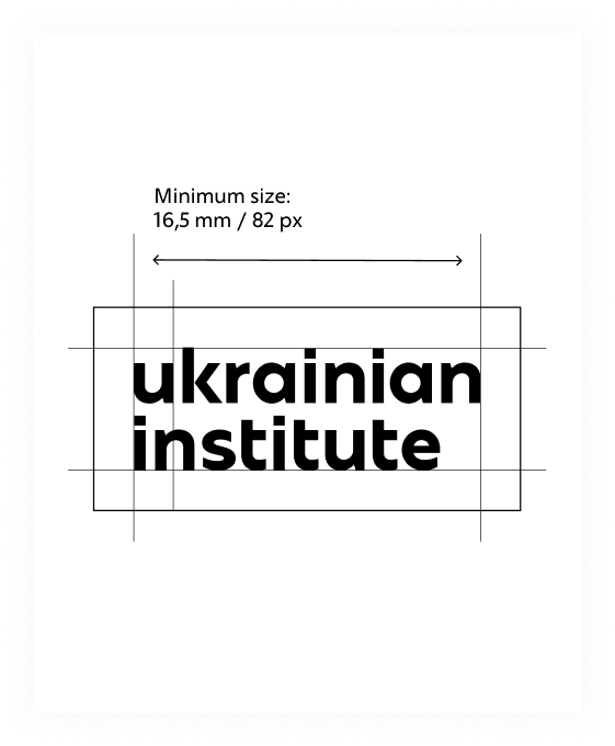
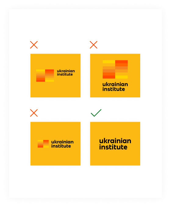
The primary version of the logo is used exclusively on black and white backgrounds.
Used in cases where a single logo is placed in the centre. Also recommended for use in a large list of partner logos that have different geometries.
Used exclusively on black and white backgrounds.
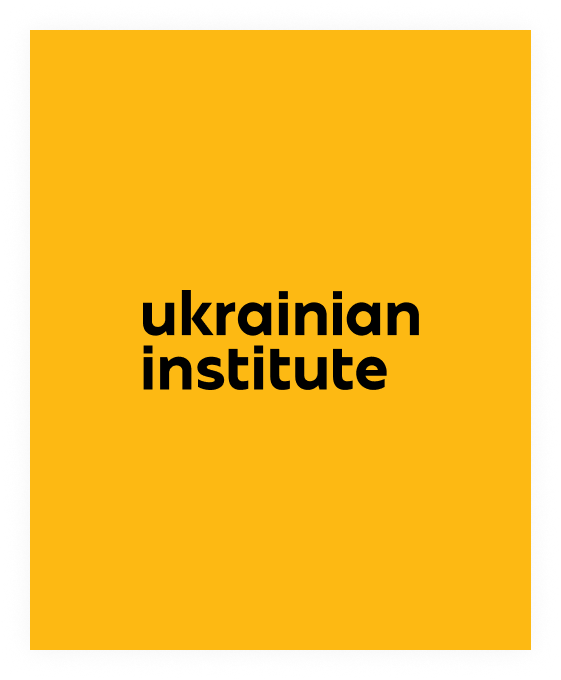
An additional version of the logo with an enlarged wordmark. Used in cases when the wordmark of the standard version is not legible at the required size for a given layout.
Used exclusively on black and white backgrounds.
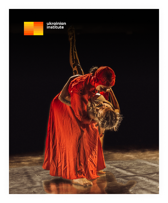
For use against coloured backgrounds and alongside other monochrome logos, as well as in layouts that require black-and-white aesthetics (for example, for images related to grief or loss).
Do not use logomark on a coloured background. Instead, place the logo with wordmark only (monochrome version).
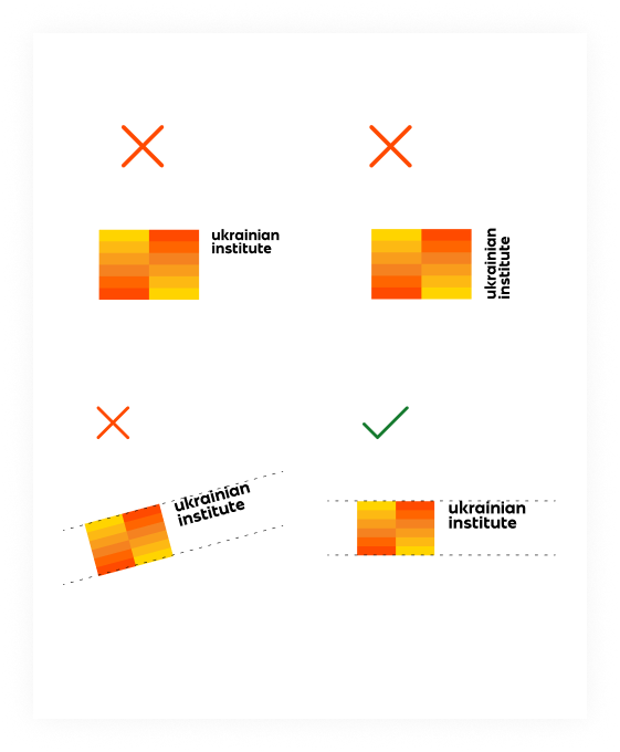
Do not tilt the logo nor modify the size and position of the logomark relative to wordmark.
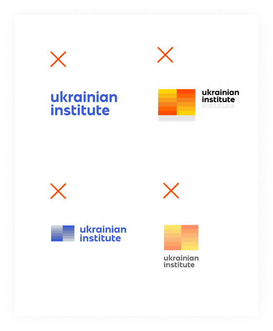
Do not alter the colours of the logomark nor assign any colours other than black and white to the wordmark. Do not apply transparency or any other effects (shadows, volume…)
Co-branding
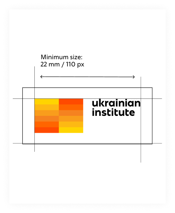
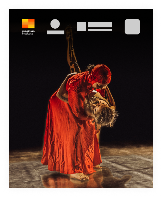
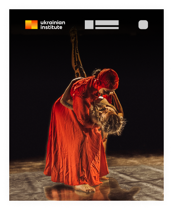
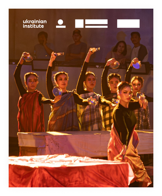
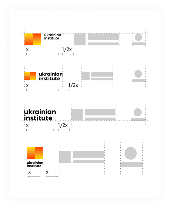
When several logos are placed together, their sizes should be balanced, with the optimal spacing being half the width of the UI logo.
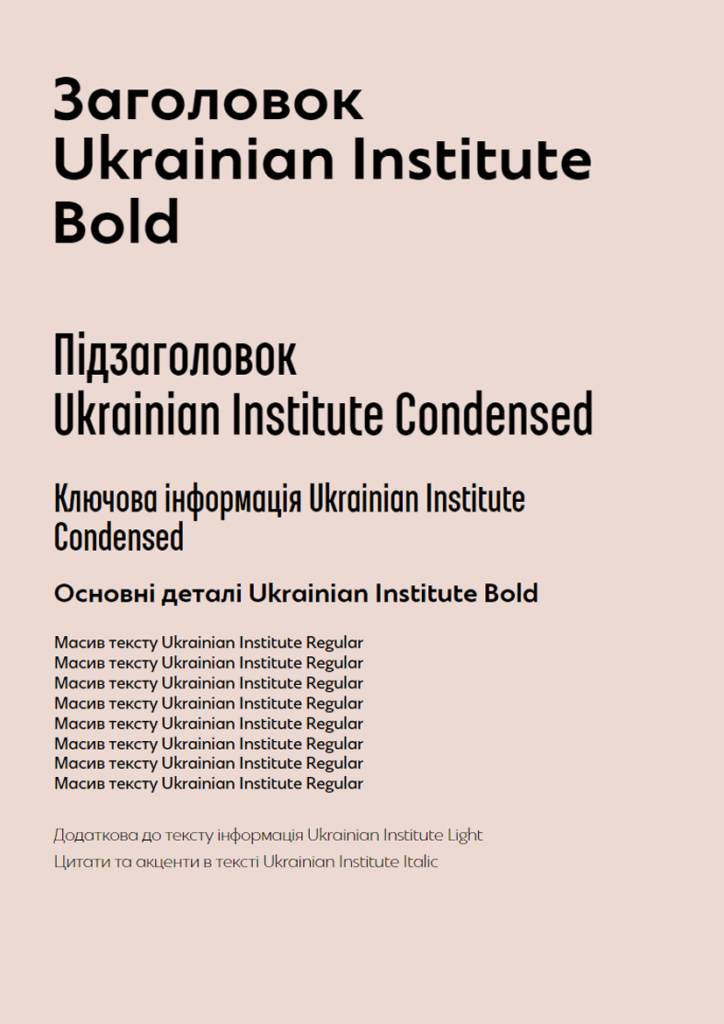
The brand typeface of the brand is the Ukrainian Institute font.
The headset has 5 different types: Bold, Regular Condensed, Regular, Italic, Light.
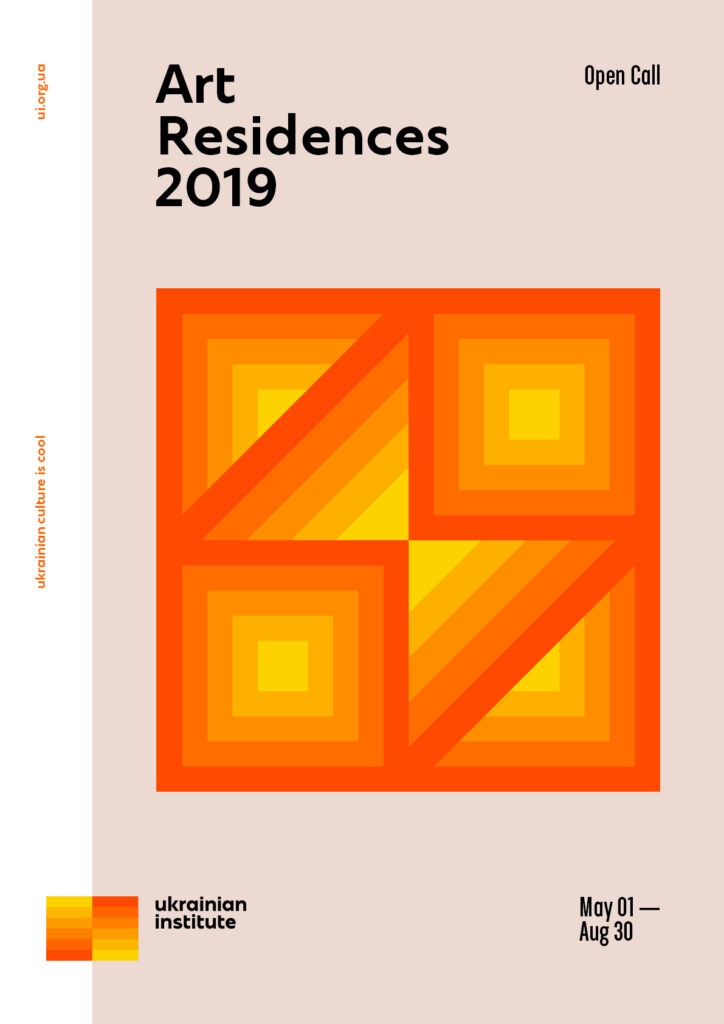
Geometric patterns are an additional element of identity.
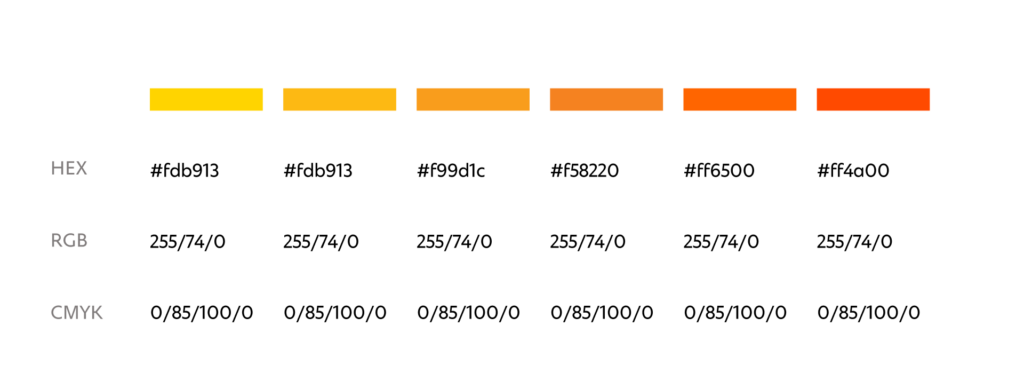
They can be used as an independent graphic element in communication or to brand branded products. The colour palette of patterns is based on the colours of the logo.
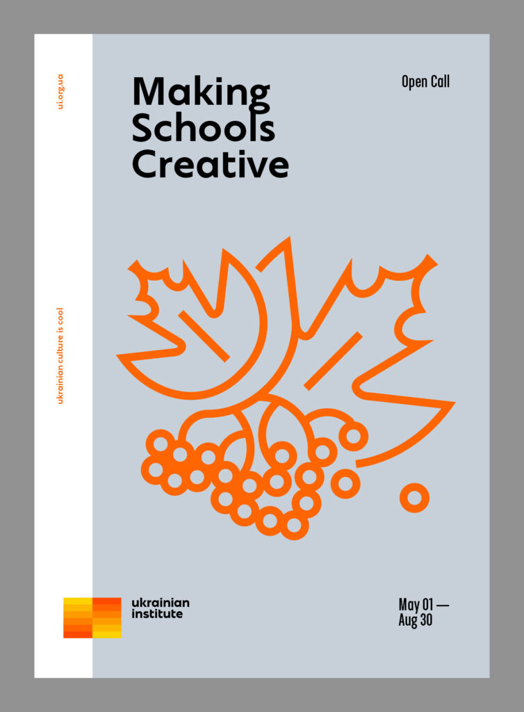
There are corporate graphics for additional use in communication within the identity. Based on her style, you can create new images.
The graphics are based on geometrized contours. When creating illustrations, it is desirable to take as a basic geometric shapes or use silhouettes close to them.
The points of connection of the contours are pointed or square, without rounding. The ends of the contours are also not rounded. The contours are of equal thickness and quite saturated.
Placing:
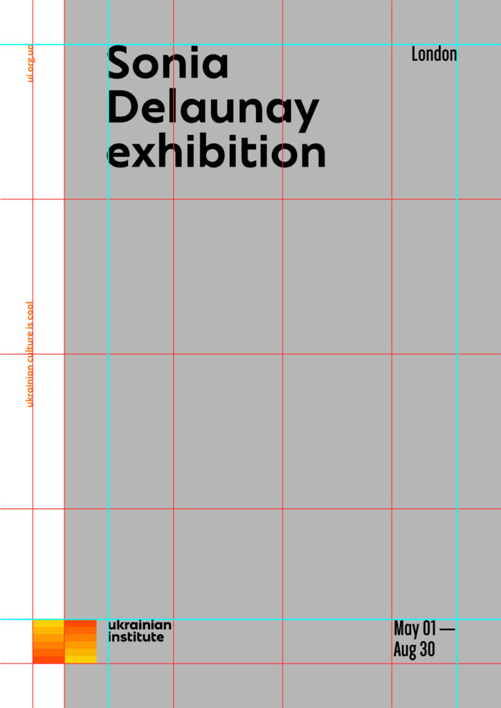
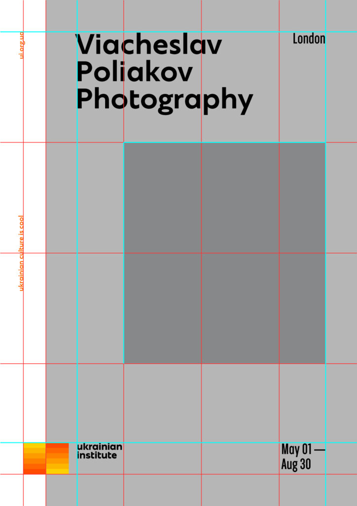
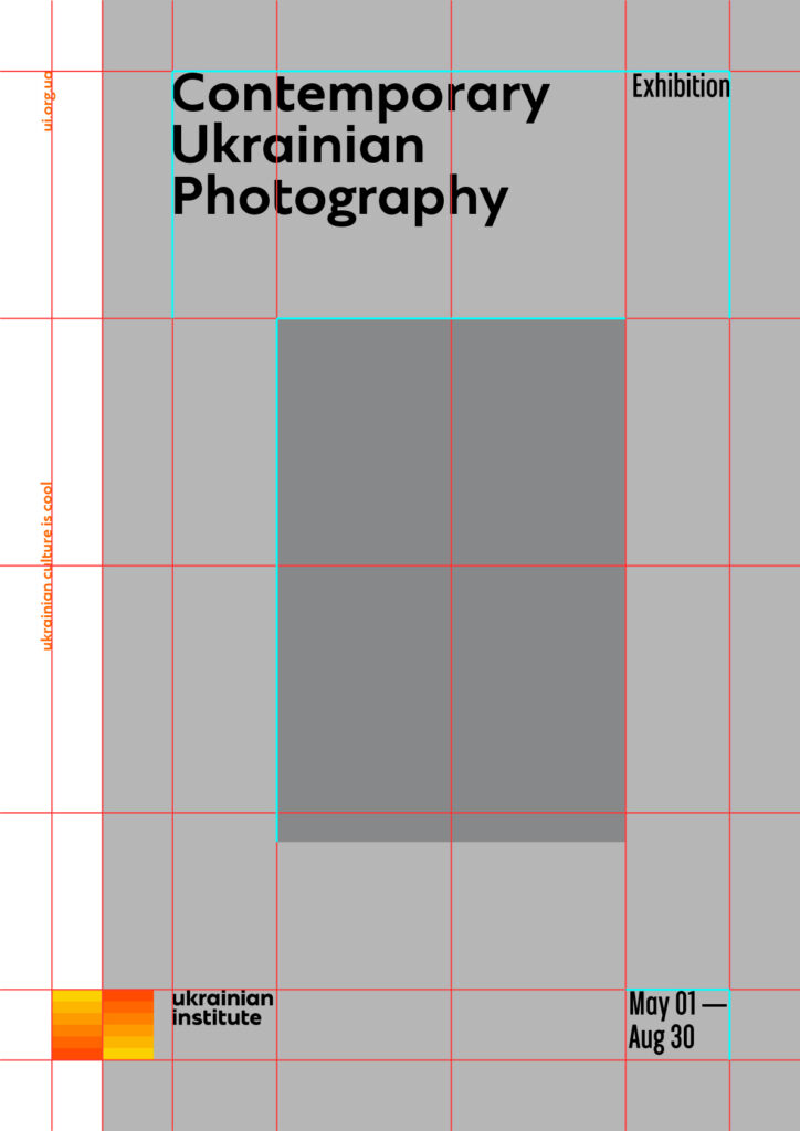
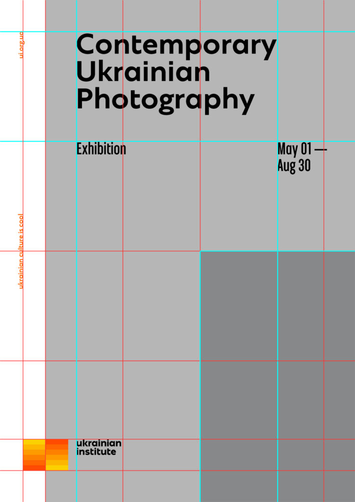
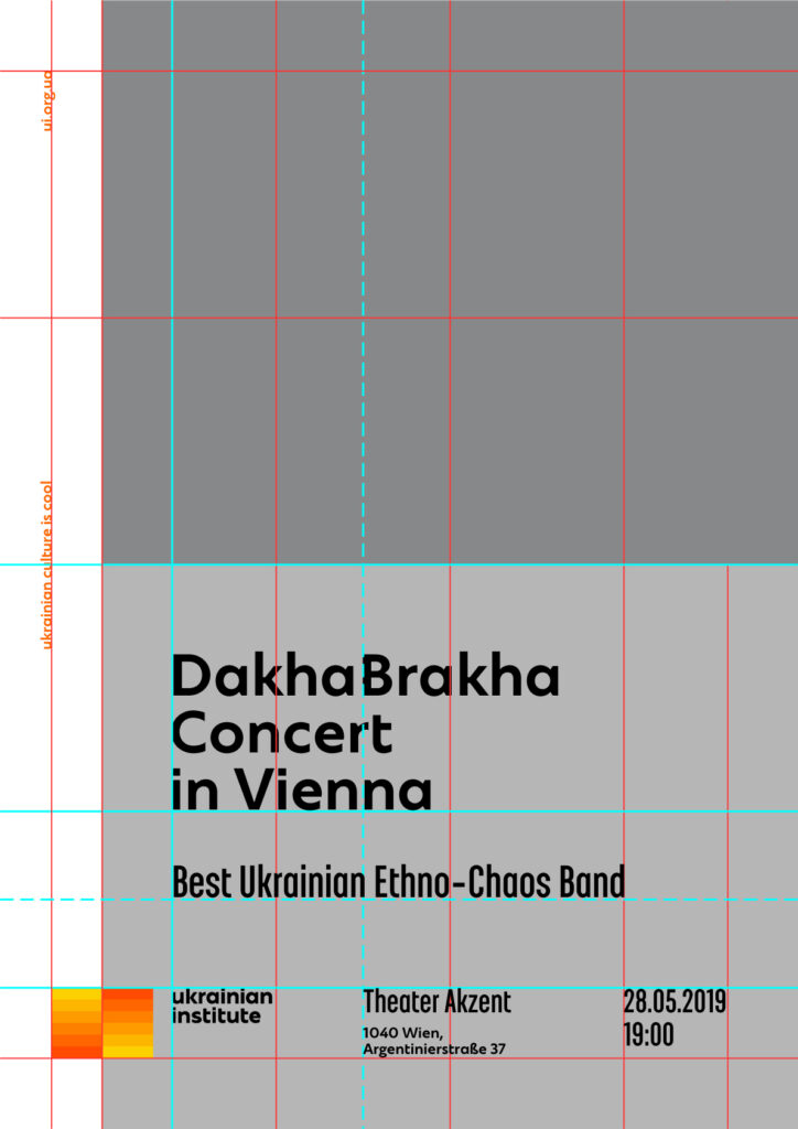
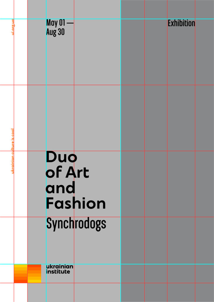
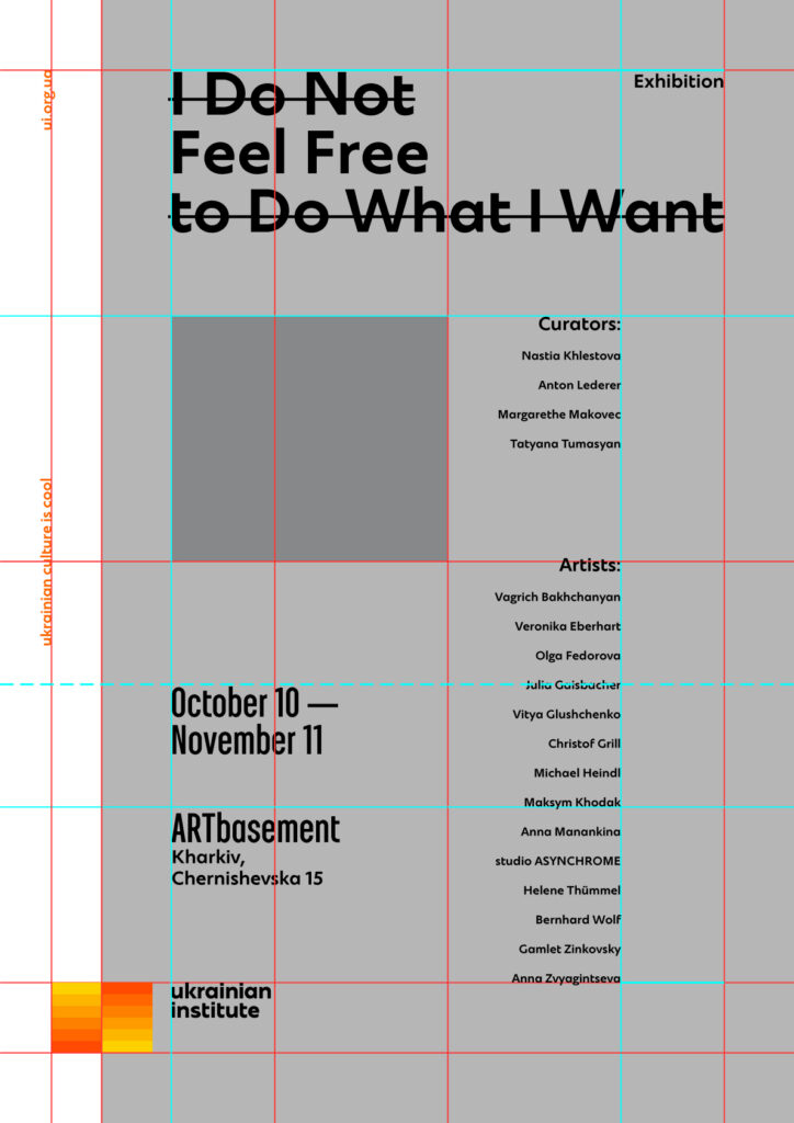
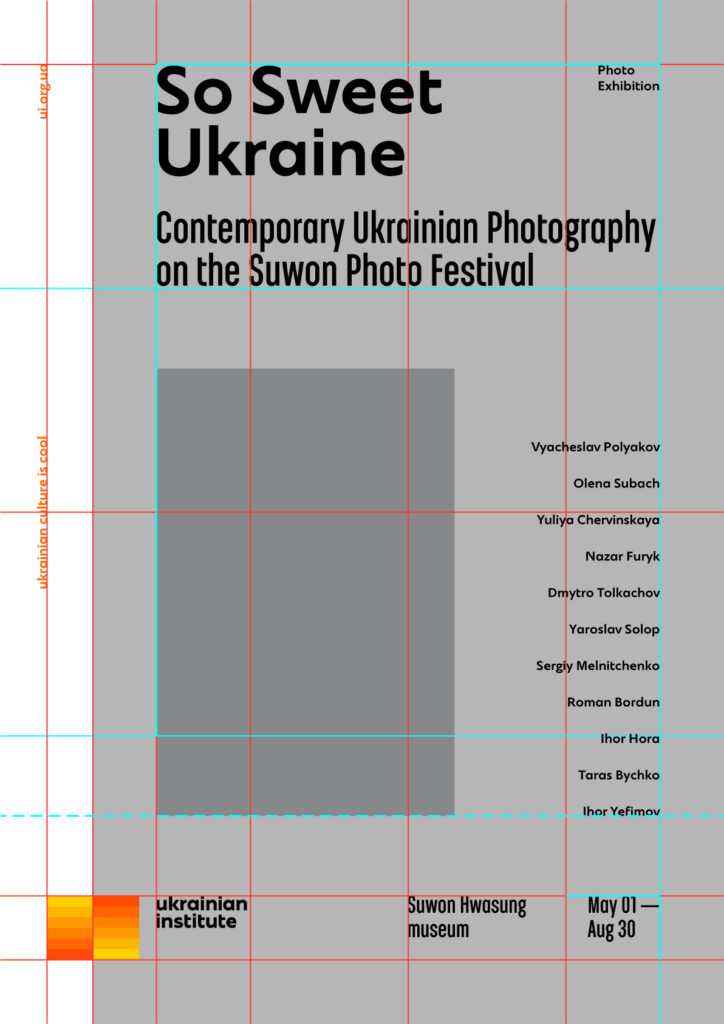
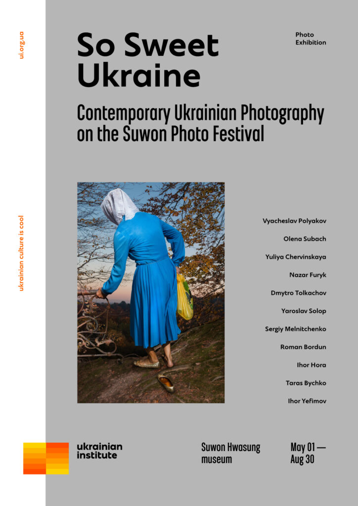
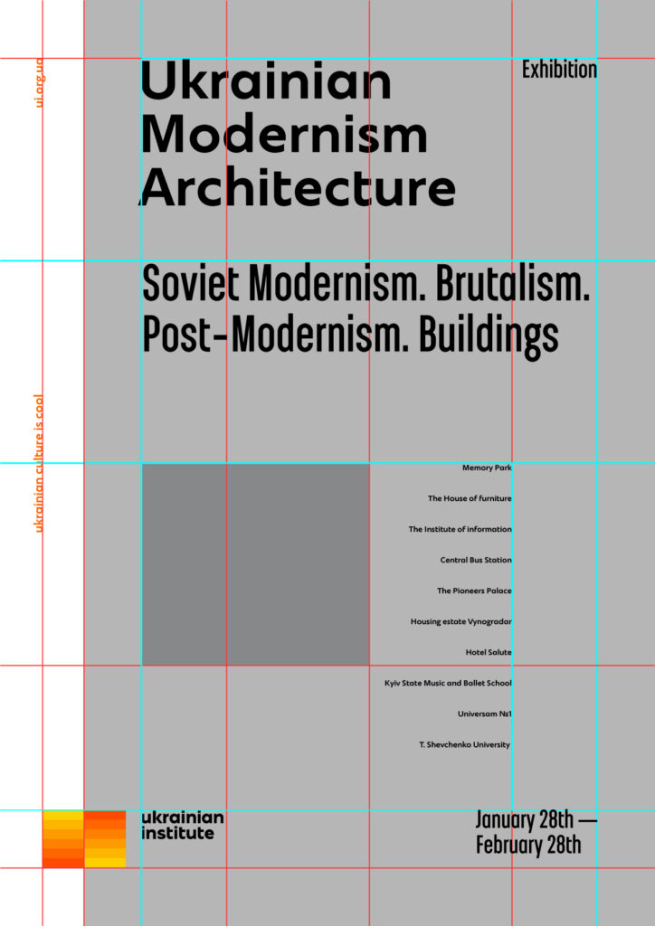
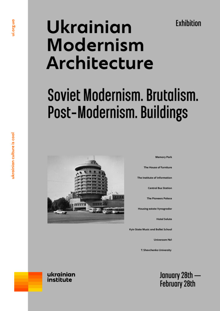
It is recommended to align the information vertically on the left side of the module.
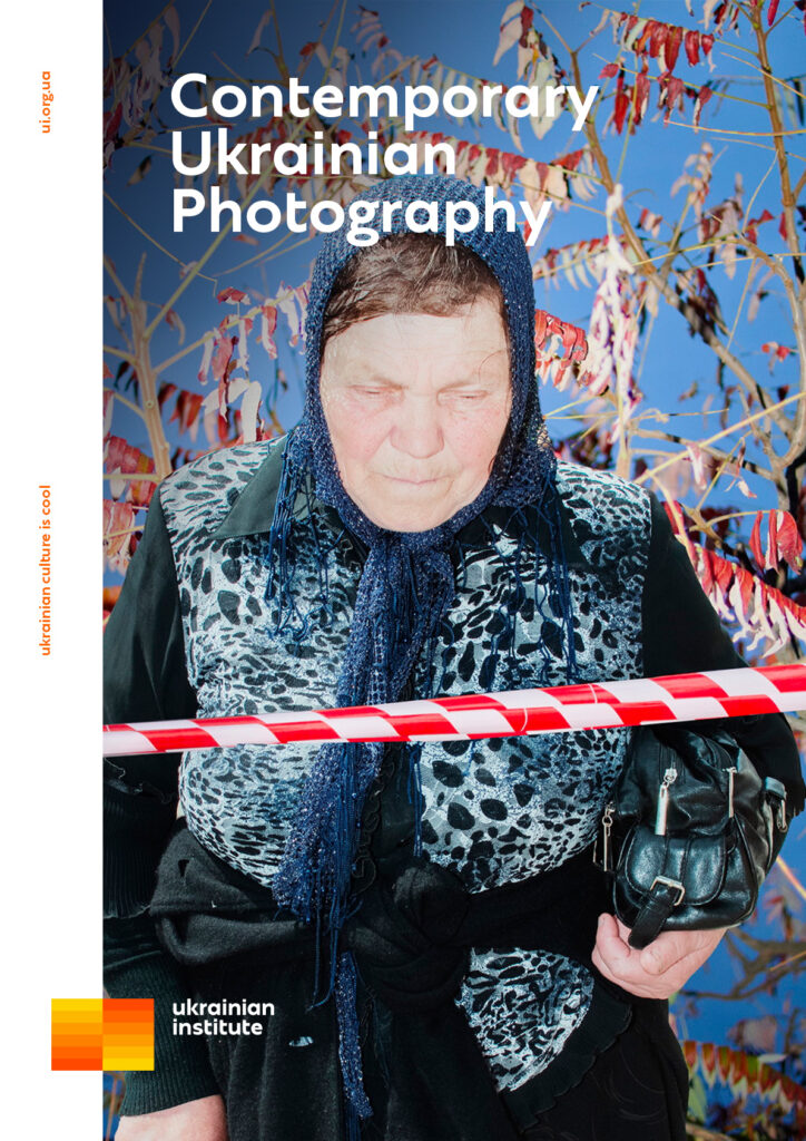
In the far right half of the poster a small amount of information (no more than 2 small blocks) – can be aligned on the right side. But if there are more than two text blocks, and they are voluminous in information, it is desirable to stick to the left side of the module.
It is recommended to align horizontally along the top line, as this is a rhyme before alignment in the logo. But this principle is not a dogma if the blocks of information need air with each other. The horizontal alignment of the logo should always be on the top line.
The alignment options:
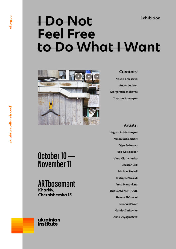
It is recommended to use left-aligned text.
For more information, you can use the right alignment of the text in the right half of the grid. In particular, if you need to place and align a large text (for example, a list of names).
Use of colour in posters
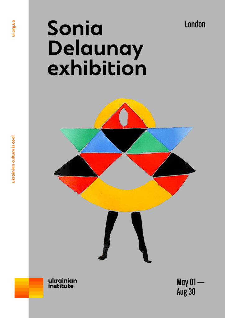
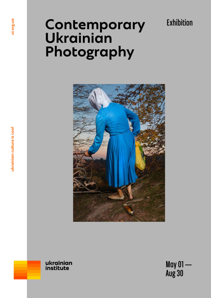
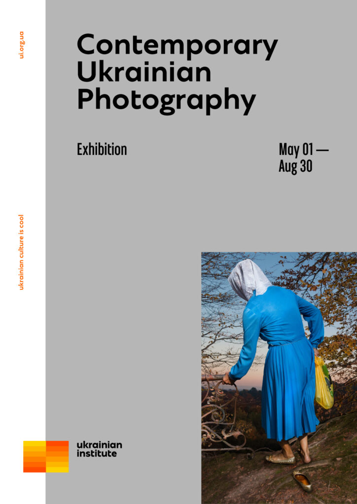
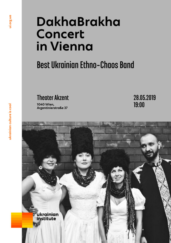
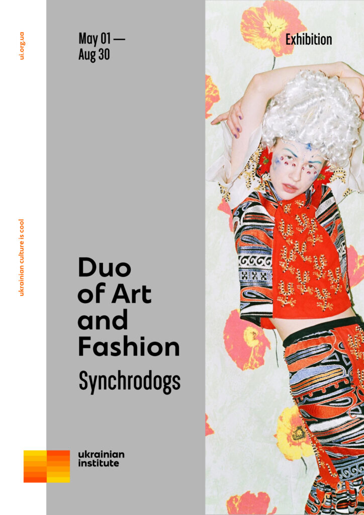
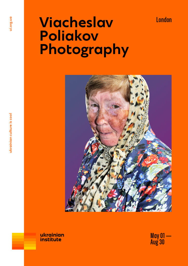
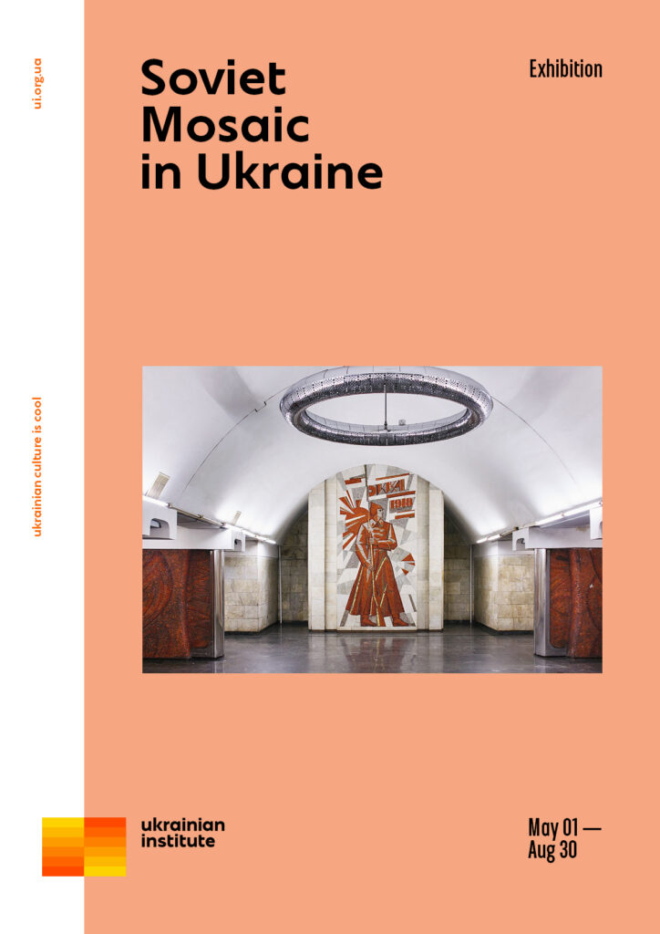
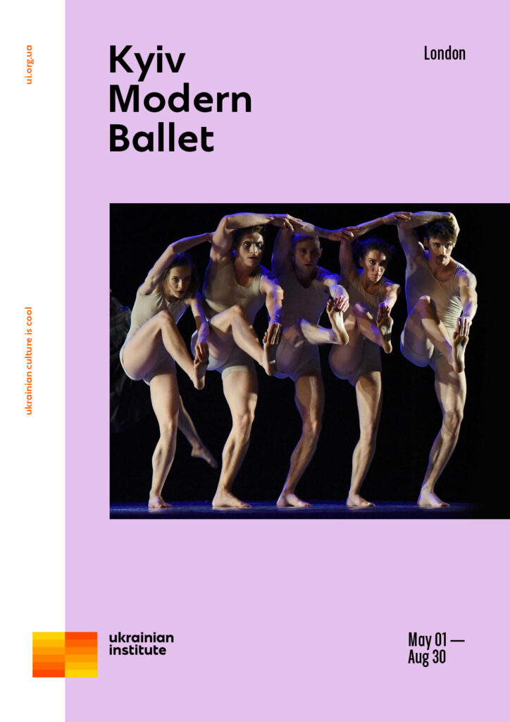
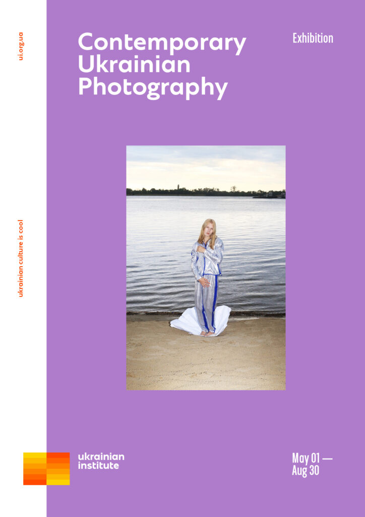
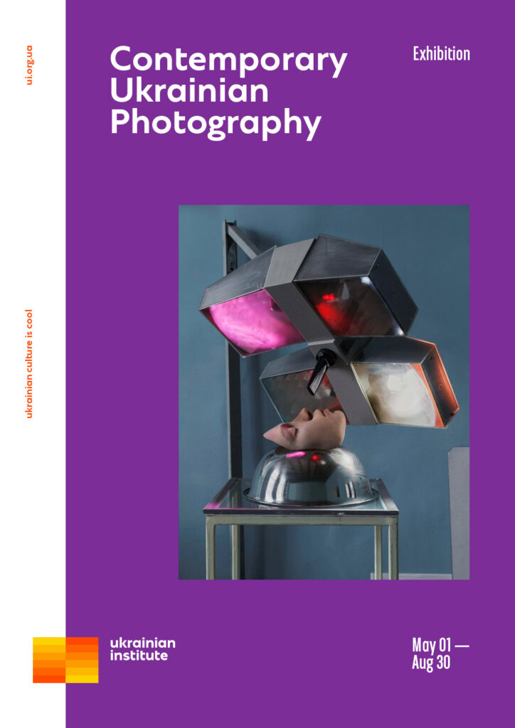
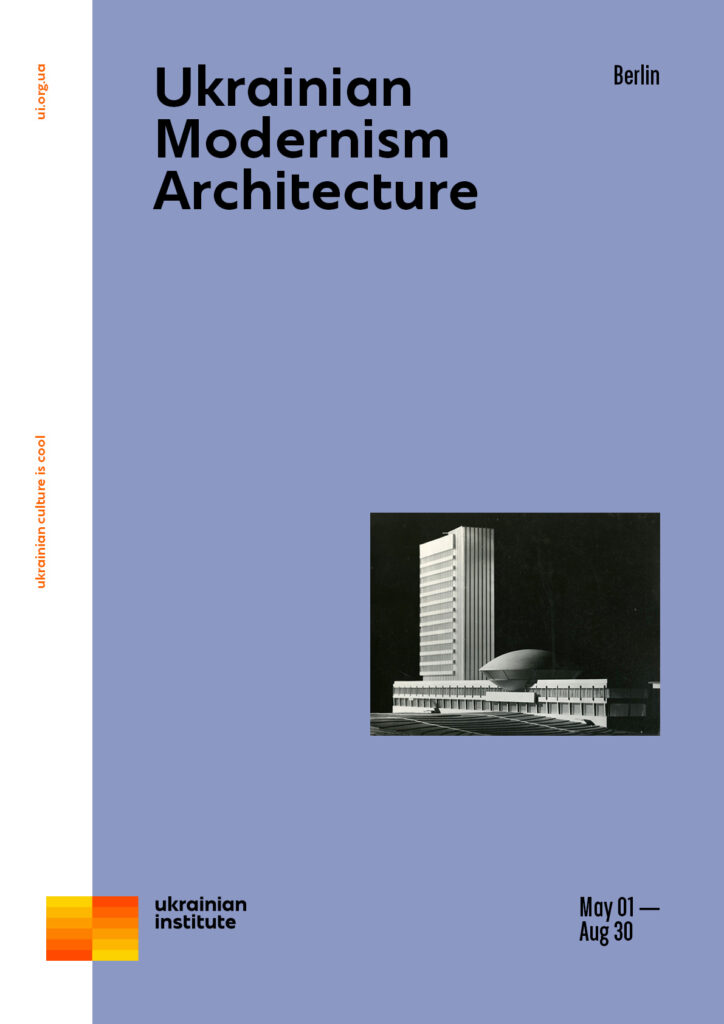
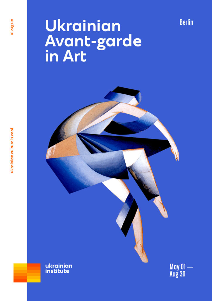
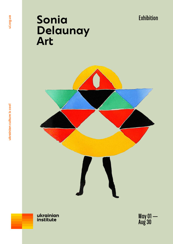
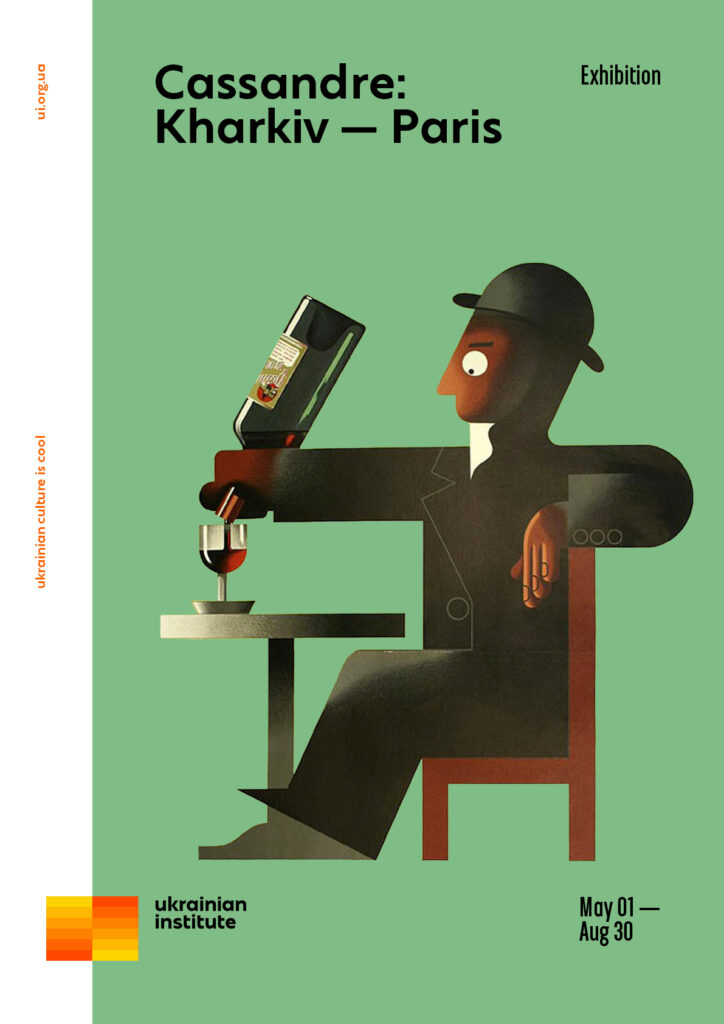
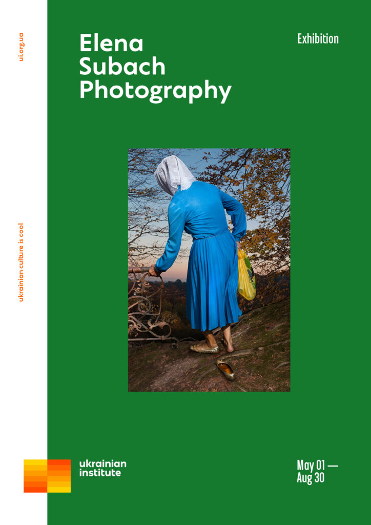
The background colour of the poster is chosen from the branded palette according to the visual content of the poster.
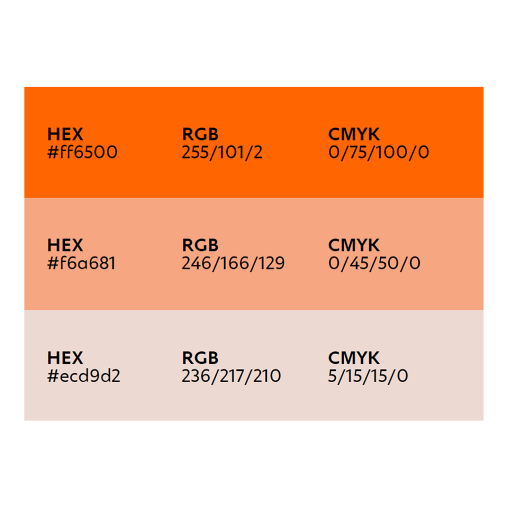
The vertical inscription on the left is coloured to visually support the colour of the logo and further reveal the idea of colour in the identity. It is recommended to use the orange colour HEX #ff6500.
Colour palette background
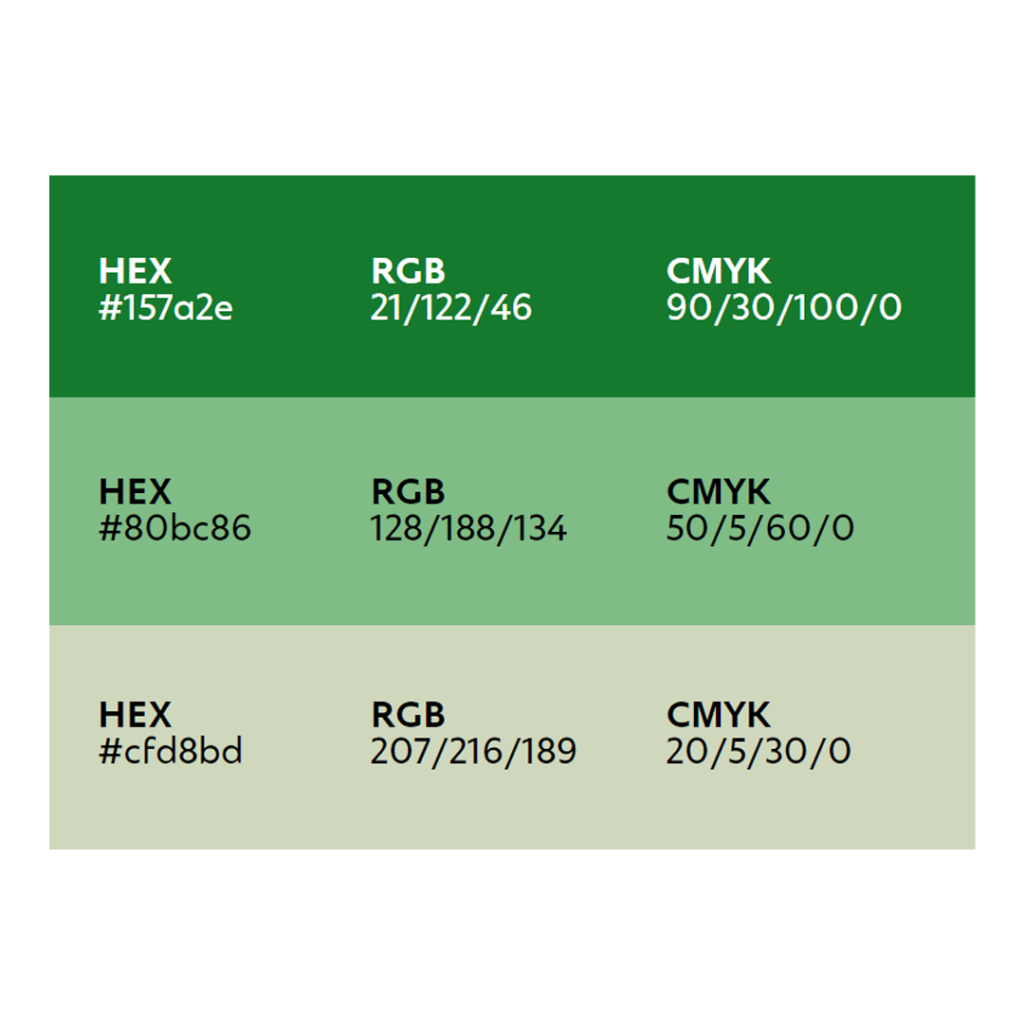
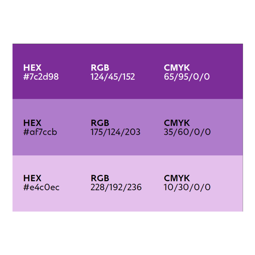
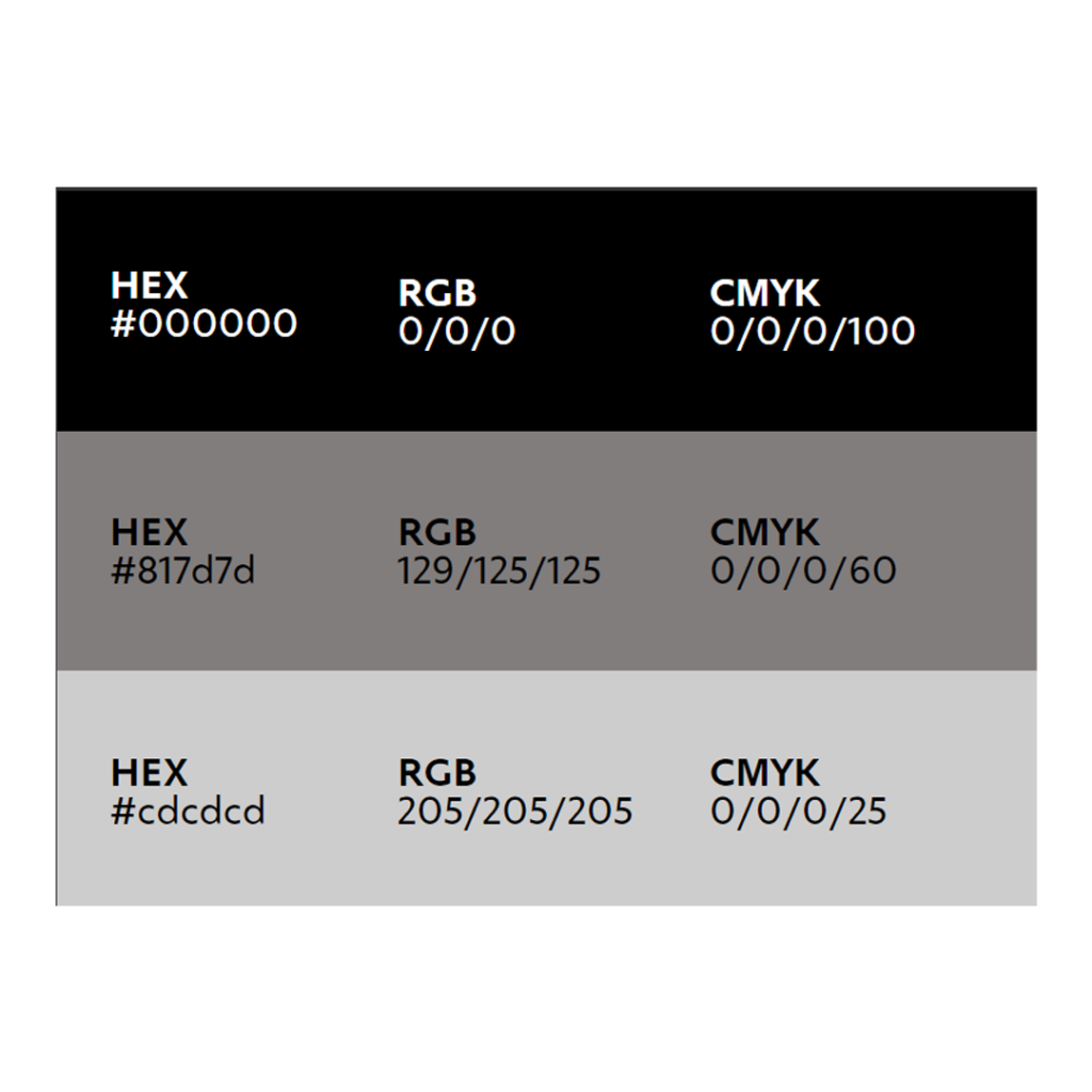
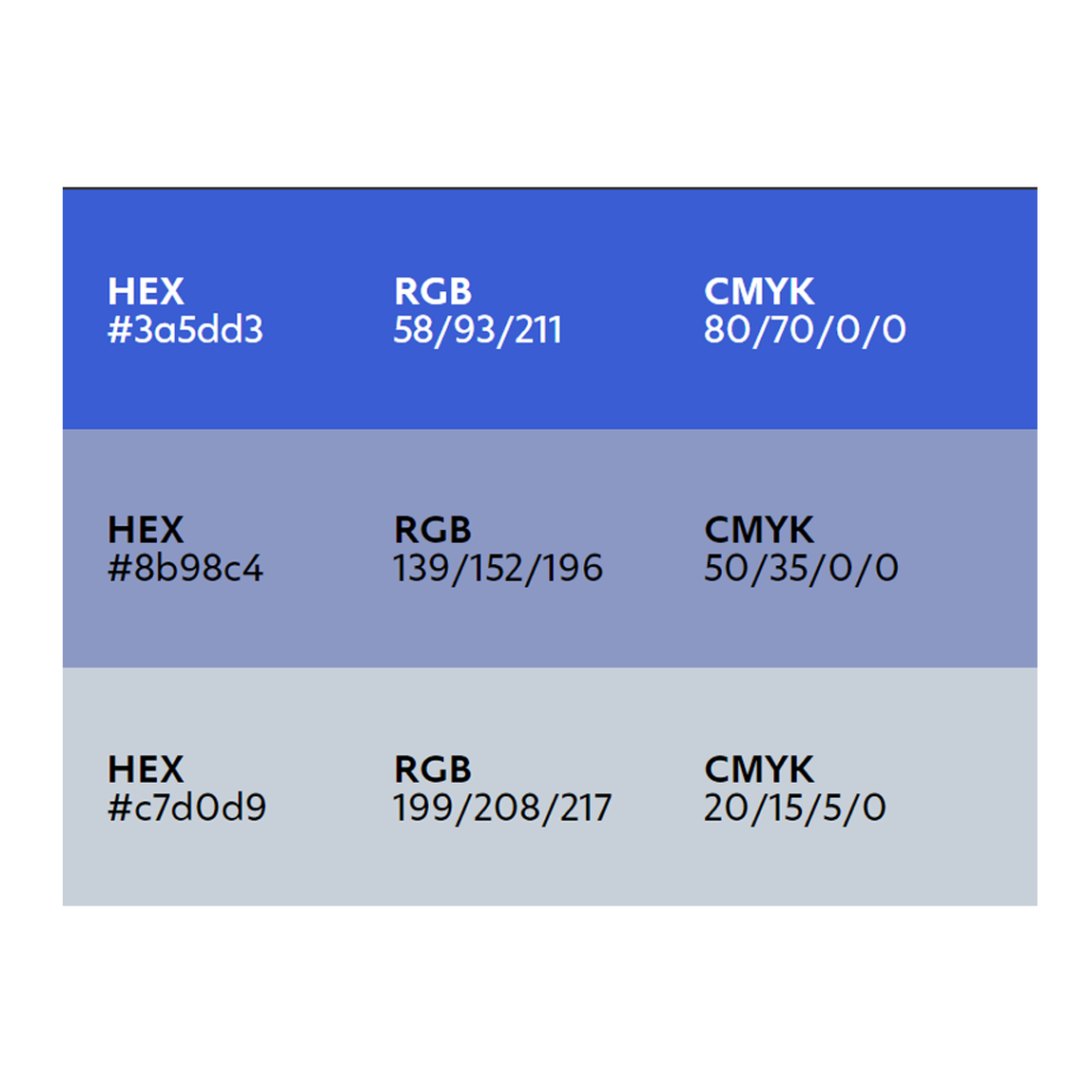
The background of the poster uses a palette of 5 colours, each of which has three saturation options, from light to bright.